
Getting images right is often the fastest way to speed up a website. In 2026, the standard workflow follows three steps: Resize, Compress, and Convert. This process keeps pages competitive at a time when users expect instant loading and Google’s ranking systems reward strong page experience.
The AVIF format has overtaken WebP as the preferred choice for web images. According to SimpleResizer, AVIF delivers roughly 20% better compression than WebP while maintaining equivalent visual quality, and it is now supported across virtually all modern browsers.
Step 1: Precise Resizing and Aspect Ratio Scaling
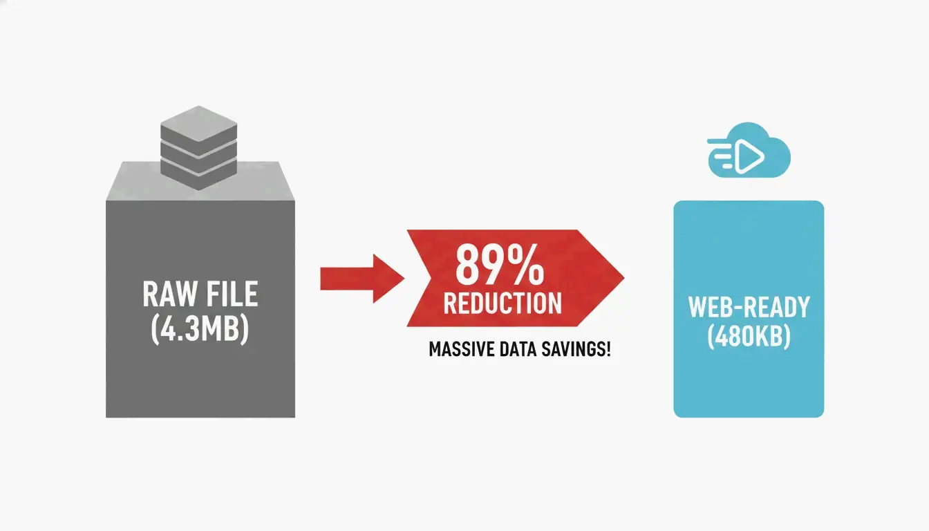
Serving an image that is significantly larger than its display dimensions is one of the most common performance mistakes. Data from DebugBear shows that resizing a raw 4.3 MB photo to standard web dimensions (such as 1266 x 845 pixels) can cut file weight by 89%.
Before uploading, check the maximum width of your site’s content area. For most blogs this falls between 800px and 1200px. Tools like Canva or Photoshop can scale images to these exact sizes. For high-density Retina displays, serve a 2x version (for example, 2400px for a 1200px container) using responsive markup, but never upload a raw 6000px+ file directly from a camera.
Step 2: Choosing Between Lossy and Lossless Compression
Compression removes data that a file does not need. In 2026, developers generally choose between two methods:
| Compression Type | How It Works | Best Use Case | Typical Quality Setting |
|---|---|---|---|
| Lossy | Discards some visual data to minimize file size | Photos, blog images, product shots | 75% – 82% |
| Lossless | Retains all original data pixel-for-pixel | Logos, technical diagrams, icons | 100% |
As purshoLOGY notes, lossy compression should be the default for photographic content to keep sites fast. Reserve lossless formats like PNG for situations that specifically require transparency or simple line graphics.
Step 3: Format Selection — AVIF, WebP, or JPEG
The format you choose has a direct impact on both file size and browser compatibility.
| Format | Compression vs. JPEG | Browser Support (2026) | Best Role |
|---|---|---|---|
| AVIF | ~50% smaller | Universal | Primary format |
| WebP | ~30% smaller | Universal | Fallback |
| JPEG | Baseline | Universal | Legacy fallback |
Impact on Core Web Vitals: LCP and CLS
Images directly affect search rankings. According to SimpleResizer, 70% of web pages feature an image as their Largest Contentful Paint (LCP) element — the largest visible block when the page loads. A heavy hero image drags down LCP scores, and rankings can follow.
Cumulative Layout Shift (CLS) is equally important. It occurs when a browser cannot determine an image’s dimensions before loading, causing text to reflow once the image appears. Always include width and height attributes so the browser reserves space immediately.
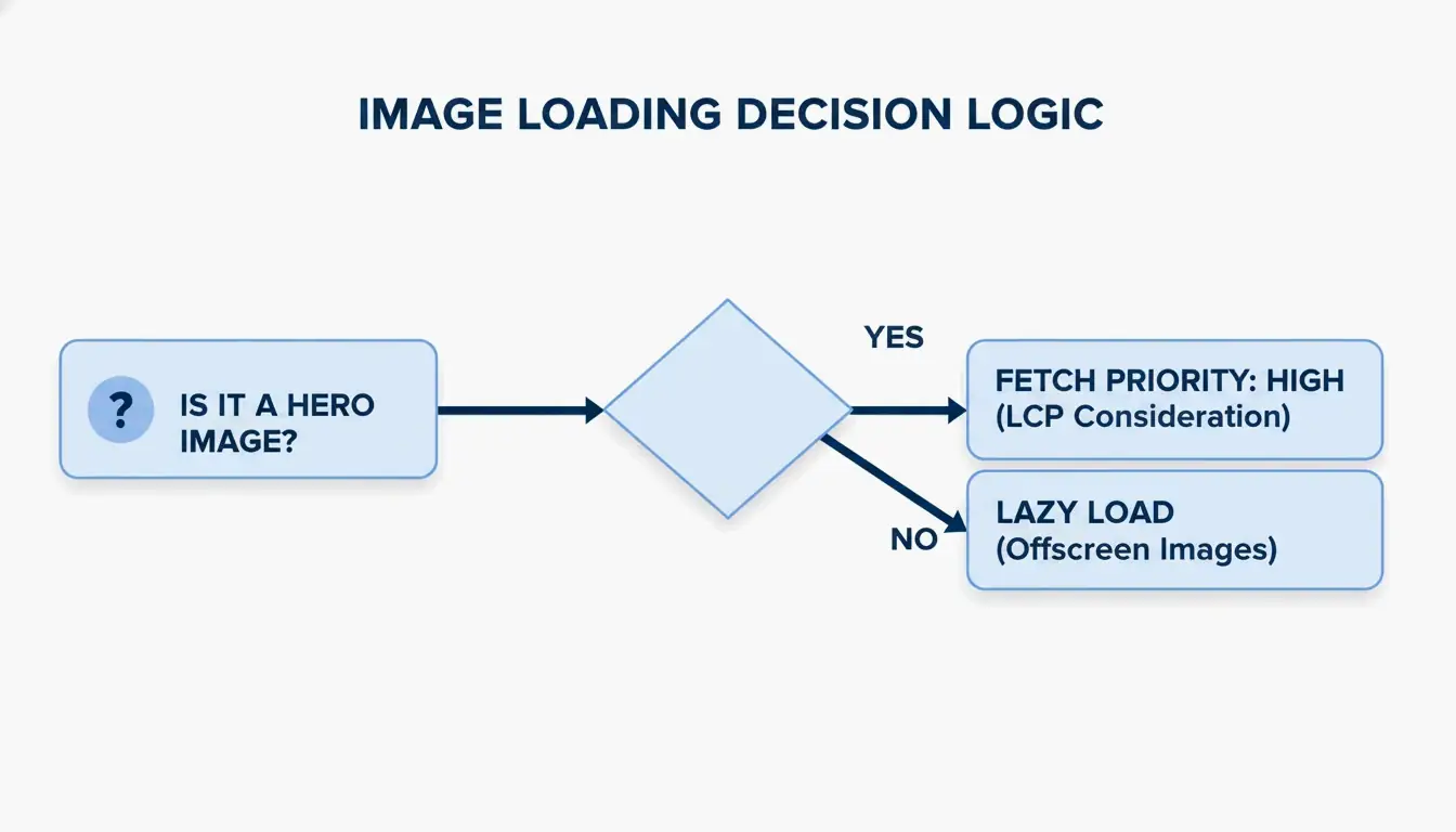
The fetchpriority=”high” Attribute
A common mistake is “over-optimizing” by lazy loading every image. While loading="lazy" benefits below-the-fold content, applying it to the hero image (the LCP element) actively slows things down.
The 2026 best practice: remove lazy loading from above-the-fold images and add fetchpriority="high" instead. This signals the browser to prioritize that specific image ahead of less critical scripts or styles.
Modern Delivery: CDN Implementation and Responsive Code
Even a small image feels slow when it has to travel across continents. A Content Delivery Network (CDN) such as Cloudflare or BunnyCDN stores copies of images on servers geographically closer to visitors.
EXIF metadata — GPS coordinates, camera settings, and other hidden data embedded in smartphone photos — should also be stripped. This saves 2% to 10% on file size and protects the privacy of whoever took the photo.
Code Snippet: The Optimal Image Tag with Fallbacks
Use the picture element to serve AVIF to modern browsers while maintaining a fallback chain for older clients:
picture
  source type image/avif srcset photo.avif
  source type image/webp srcset photo.webp
  img src photo.jpg width 1200 height 675 alt "Descriptive alt text" loading lazy decoding async
A GIMP test demonstrated that shrinking a JPEG from 1072 KB to 384 KB (a 64% reduction) using techniques like Chroma subsampling (4:2:0) produces significant gains without any perceptible quality loss.
Top Tools for Automated Image Optimization
| Tool | Type | Strength | Best For |
|---|---|---|---|
| Squoosh | Manual / Free | Full control over AVIF and WebP settings | One-off compression |
| TinyPNG | Manual / Free | Fast batch shrinking | Quick bulk jobs |
| Imagify | Automated / Paid | Scans entire library, converts to AVIF, serves via CDN | WordPress sites |
| EWWW Image Optimizer | Automated / Paid | Full-pipeline automation with CDN | E-commerce stores |
As SimpleResizer points out, Google Images can account for 20-30% of all search traffic for online stores, making automated optimization a measurable revenue driver.
Conclusion
Optimizing photos for the web in 2026 means managing three levers: format selection (AVIF primary, with fallbacks), delivery infrastructure (CDN), and browser priority hints (fetchpriority). A fast site is no longer optional — it is a requirement for retaining users and ranking well in search.
Action Step: Run your site through PageSpeed Insights to identify LCP bottlenecks. Then set up an automated AVIF pipeline with JPEG fallbacks to keep your site fast and accessible on every device.
FAQ
Does optimizing images affect their visual quality on Retina displays?
High-density displays need 2x or 3x resolution to look sharp. Use the srcset attribute to send high-resolution versions only to devices that can display them. Modern formats like AVIF preserve significantly more detail at these resolutions than older JPEG files, even at substantially smaller file sizes.
Should I use AVIF or WebP as my default image format in 2026?
AVIF is the better choice for most use cases. It offers approximately 20% better compression than WebP at the same quality level, and nearly all current browsers support it. However, always include a WebP or JPEG fallback using a picture element so the site remains functional for visitors on older browsers or devices.
How do I fix the “Largest Contentful Paint image was lazily loaded” error?
Identify the hero image — typically the large banner or product photo at the top of the page. Remove the loading="lazy" attribute from that specific img tag, because lazy loading instructs the browser to defer loading. Instead, add fetchpriority="high" to tell the browser to fetch that image immediately.
Is it safe to strip EXIF metadata from all website photos?
Yes, and it is recommended. Stripping EXIF data typically saves between 2% and 10% of file size. It also protects privacy by removing GPS coordinates and other sensitive information. The only exception is when your industry requires copyright or author metadata for legal compliance.
Leave a Reply