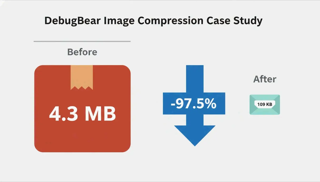
Image optimization reduces file sizes while preserving visual quality. The core workflow: resize to display dimensions, compress at 75-85% quality, convert to WebP or AVIF, add lazy loading, and set explicit width/height attributes. A DebugBear case study achieved a 97.5% reduction (4.3 MB → 109 KB) using this exact sequence.
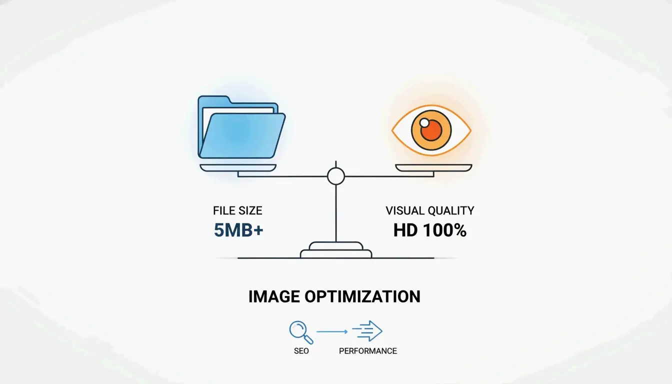
Why Image Optimization Matters
Images account for approximately 64% of total page weight (Sanity). Unoptimized images directly hurt:
| Metric | Impact | Cause |
|---|---|---|
| LCP (Largest Contentful Paint) | Pushed past 2.5s threshold | Bloated hero images |
| CLS (Cumulative Layout Shift) | Content jumps on load | Missing width/height attributes |
| Bounce rate | Visitors leave before content loads | Slow initial paint |
| Mobile rankings | Lower search position | Excessive bandwidth on variable networks |
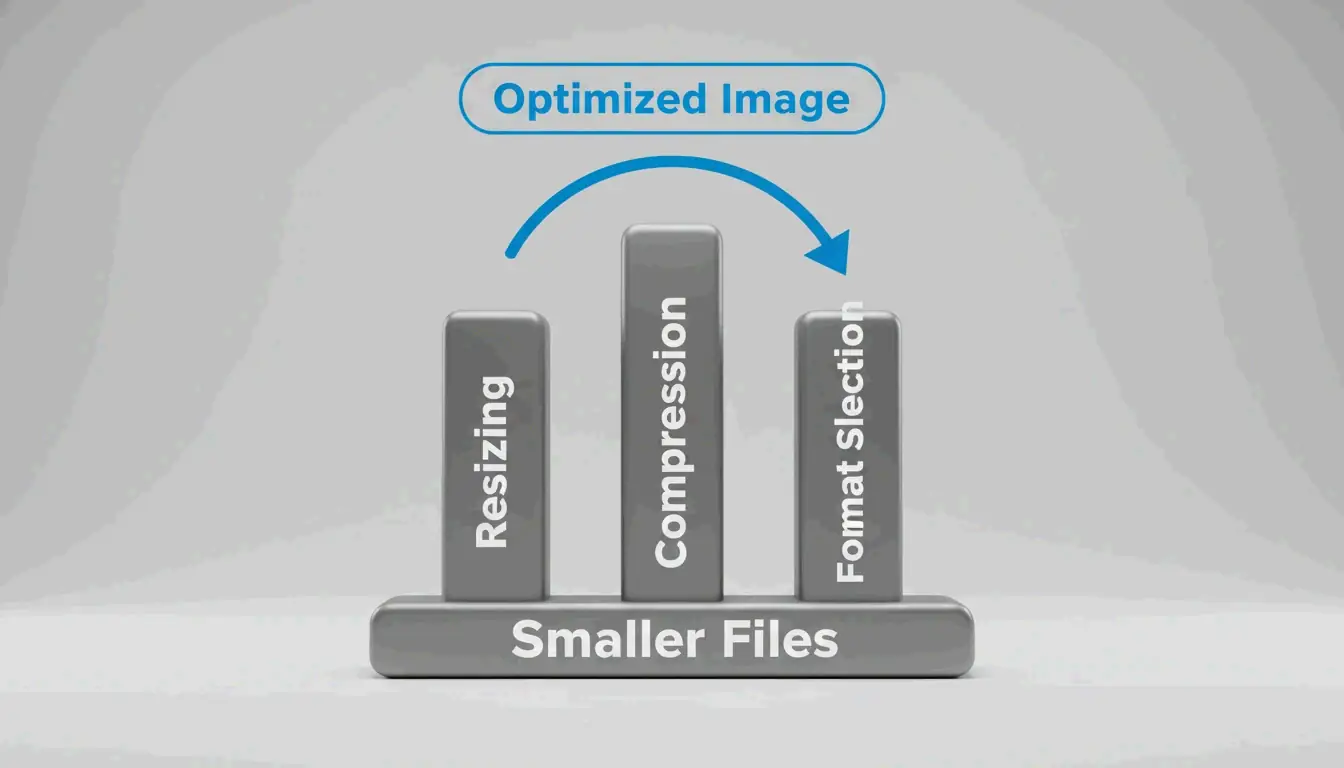
The Three Pillars: Resize, Compress, Format
Pillar 1: Resizing — The Largest Single Win
Serving images at their actual display size is the biggest optimization. The DebugBear case study shows a 7108×4744 photo displayed at 1266×845: resizing alone reduced the file from 4.3 MB to 495 KB (89% reduction).
Steps:
- Determine display dimensions — WordPress.com recommends uploading at 1.5-2× content area width for crisp results.
- Resize before uploading — use Preview (Mac), Paint (Windows), or GIMP.
- Add responsive images with
srcsetandsizesattributes to serve different widths (400w, 800w, 1600w) based on viewport size.
This lets the browser pick the right file for each viewport — mobile users download smaller files, desktop users get sharp versions.
Pillar 2: Compression — Lossy vs. Lossless
| Mode | How It Works | File Size | Best For |
|---|---|---|---|
| Lossy | Permanently removes some data | Smaller (40-60% reduction) | Photos, complex images |
| Lossless | Preserves all data exactly | Larger | Logos, text, screenshots, transparency |
For most web images, lossy compression at quality 75-85 provides the optimal balance. Both WebP and AVIF support both modes.
Pillar 3: Format Selection — WebP vs. AVIF vs. JPEG
| Format | Compression vs. JPEG | Encoding Speed | Browser Support (2026) | Best For |
|---|---|---|---|---|
| WebP | 25-35% smaller | Fast | 97%+ | LCP images, general use |
| AVIF | ~50% smaller | 50% slower than WebP | 92%+ | Maximum compression |
| JPEG | Baseline | Fastest | 100% | Universal fallback |
Decision framework:
| Scenario | Recommended Format |
|---|---|
| LCP/above-the-fold hero image | WebP (faster encoding, wider support) |
| Total page weight reduction | AVIF (better compression) |
| Product photography (HDR) | AVIF (wide color gamut) |
| User-generated content | WebP (faster processing) |
| Animated graphics | WebP (animation support) |
| Graphics with text/sharp lines | WebP lossless |
Hybrid approach (recommended): Per Framer, serve WebP on first request, convert to AVIF in the background, then serve AVIF on subsequent visits. You get fast initial delivery and smaller cached files.
Lazy Loading and Responsive Images
Lazy loading defers off-screen images until they’re needed, saving bandwidth and improving initial load. Add loading="lazy" to any below-the-fold image tag.
Rules:
- Never lazy-load above-the-fold images — this delays LCP.
- Prioritize LCP images with
fetchpriority="high". -
Preload critical CSS background images in
<head>usingrel="preload" as="image" fetchpriority="high". -
Always set explicit width and height attributes on image elements to prevent CLS.
Tool Comparison
| Tool | Best For | Formats | Batch | Cost |
|---|---|---|---|---|
| Squoosh | Developer format comparison | WebP, AVIF, JPEG, PNG | Yes | Free |
| TinyPNG | Designer single-image optimization | WebP, JPEG, PNG | 20 files | Free |
| ImageLean | Privacy-focused browser compression | WebP, AVIF, JPEG, PNG | Yes | Free |
| Smush | WordPress site owners | WebP, AVIF, JPEG, PNG | Bulk | Free/Pro |
| Cloudflare Images | CDN-delivered global scaling | Auto-conversion | On-the-fly | Pay-per-use |
| Next.js Image | React/Next.js projects | Auto WebP/AVIF | Automatic | Free |
CDN vs. Plugin Optimization
| Approach | How It Works | Pros | Cons |
|---|---|---|---|
| CDN-based (Cloudflare, Fastly) | Optimizes at network edge, caches result | Zero manual work, device-adaptive | Requires CDN subscription |
| Plugin-based (Smush, TinyPNG) | Processes on upload or via API | More control over output | Must run bulk on existing images |
Best practice: Hybrid — CDN for on-the-fly delivery + plugin for upload compression. CDNs cut image load times by 50%+ for international visitors (DebugBear).
Automation Workflows
CI/CD Pipeline
GitHub Actions can auto-compress and convert formats on every push using Squoosh CLI or sharp. All images in the codebase are optimized before deployment.
Headless CMS
Platforms like Sanity serve optimized images with on-the-fly transformations — store one high-quality source, get thumbnails, responsive sizes, and modern formats automatically.
E-commerce
- WooCommerce: Smush integrates directly — auto-compress on upload, bulk optimize galleries, CDN for global delivery.
- Shopify: Built-in pipeline handles optimization. Ensure source images are correctly sized before upload and themes generate proper
srcsetattributes.
Fixing PageSpeed Insights Warnings
| Warning | Cause | Fix |
|---|---|---|
| “Properly size images” | Image larger than display size | Resize to match container + use srcset |
| “Serve images in next-gen formats” | Using JPEG/PNG instead of WebP/AVIF | Convert with Squoosh or Smush auto-conversion |
| “Defer offscreen images” | All images load immediately | Add loading="lazy" to below-fold images only |
| “Eliminate render-blocking resources” | Large Base64-encoded images in CSS/HTML | Serve as separate files; avoid Base64 for >few hundred bytes |
Conclusion
Optimize images in sequence: resize → compress → convert to modern format → add lazy loading → set explicit dimensions. Automate with a CDN/plugin hybrid. Start by auditing your site with DebugBear — the 97.5% size reduction from the case study is achievable for most sites with these techniques.
FAQ
What is the difference between lossy and lossless compression?
Lossy permanently removes data for smaller files — suited for photos. Lossless preserves all data exactly — suited for logos, text, and screenshots. WebP and AVIF support both modes. For web images, lossy at 75-85% quality is the standard.
Should I use WebP or AVIF in 2026?
WebP for LCP/above-the-fold images (faster encoding, wider support). AVIF for maximum compression (smaller files, slower encoding). Use the hybrid approach: WebP on first load, AVIF for cached subsequent visits.
How do I fix “Properly size images” and “Next-gen format” PageSpeed warnings?
Resize images to match their display dimensions. Convert JPEG/PNG to WebP or AVIF. Use srcset with the <picture> element to serve appropriate versions per screen size and format support. WordPress users can automate this with the Smush plugin.
Leave a Reply